

Next js 다크, 라이트 모드 적용하기
Theme 적용이 왜 이렇게 어려울까?

⭐️ 이번 글에서 다룰 내용입니다! ⭐️
- next.js theme 적용하며 겪은 이슈
- 현재 적용한 방식에 대한 내용
- css variable 적용
테마의 필요성?
테마 모드가 없었을 땐 기본 Light 모드를 사용하고 있는 유저에게 비정상적인 UI 를 보여주고 있었습니다ㅠㅠ..
보이시는 것과 같이 다크 모드 기준 text color 가 white 톤이라 내용을 구분할 수가 없습니다..
위 버그를 제보 받은 후, 후다닥 퇴근해서 body tag 에 dark mode color, background color 를 적용하여,
모든 유저가 다크 모드를 사용하는... 🥲 정말 임시방편 조치를 취했습니다..
이제부터 천천히 차근차근하게 다크, 라이트 테마를 적용하겠습니당 :D
styled-components 의 ThemeProvider (삽질 시작)
가장 먼저 생각난 것은 styled components 의 ThemeProvider 였습니다.
익숙하게 사용하던 Tool 이기도 하고 빠르게 적용할 수 있을 것 같아서 바로 적용했습니다.
babelrc 파일 추가 및 설정 추가
styled components 를 사용하기 위해 아래 설정을 추가했습니다.
{
  "presets": ["next/babel"],
  "plugins": [["styled-components", { "ssr": true, "displayName": true }]]
}
기본 테마 설정 및 GlobalStyles 추가
dark, light 테마에 대한 기본 색상 지정 및 GlobalStyles 를 추가했습니다.
import { createGlobalStyle } from "styled-components";

type Theme = {
  color: string;
  background: string;
};

export const lightTheme: Theme = {
  color: "#000000",
  background: "#ffffff",
};

export const darkTheme: Theme = {
  color: "#ffffff",
  background: "#202125",
};

export const GlobalStyles = createGlobalStyle<{ theme: Theme }>`
  body {
    background: ${({ theme }) => theme.background};
    color: ${({ theme }) => theme.color};
    transition: background 0.2s ease-in, color 0.2s ease-in;
  }
`;
inital Theme 지정을 위한 유틸 함수 추가
prefers-color-scheme 에 접근해서 theme 를 확인하는 방법입니다.
export const getInitialTheme = () => {
  const mql = window.matchMedia("(prefers-color-scheme: dark)");

  return mql.matches ? "dark" : "light";
};
App.tsx 에 적용!
아래와 같이 ThemeProvider 와 GlobalStyles 를 적용했습니다.
useState 에 getInitialTheme 를 적용하지 않은 이유는 getInitialTheme 는
window 객체에 접근하는 코드이며, 이는 window 에 접근이 필요하다는 의미입니다.
근데 next.js 를 사용할 경우 먼제 서버에서 html 을 만들게 되고 이 때 window 객체에
접근할 수 없어 에러가 발생합니다. 이를 방지하고자 간단하게 useEffect 를 사용했습니다.
import type { AppProps } from "next/app";
import { useEffect, useState } from "react";
import { ThemeProvider } from "styled-components";

import { lightTheme, darkTheme, GlobalStyles } from "./styles/theme";

import { getInitialTheme } from "../lib/getInitialTheme";

import "../styles/globals.css";

// This default export is required in a new `pages/_app.js` file.
function MyApp({ Component, pageProps }: AppProps) {
  const [theme, setTheme] = useState<string>("dark");

  useEffect(() => {
    const initialTheme = getInitialTheme();

    setTheme(initialTheme);
  }, []);

  return (
    <ThemeProvider theme={theme === "dark" ? darkTheme : lightTheme}>
      <GlobalStyles />
      <Component {...pageProps} />
    </ThemeProvider>
  );
}

export default MyApp;
섬광 현상 발생..
페이지 새로고침을 할 경우, 위와 같이 섬광 현상이 발생하고 있습니다.
관련해서 참고한 블로그입니다 joshwcomeauv dark-mode-flash
간단하게 요약하자면 아래와 같습니다.
HTML 이 사용자 기기(컴퓨터, 노트북 등등)에 접근하기 전에 생성되기 때문에
사용자 내부 설정 테마를 알 방법이 없다는 점이 문제입니다.
이로 인해 처음 렌더링은 theme 와 관계없는 스타일 보여주고, 사용자 테마에 접근 후
테마 변경을 하는 과정이 있기에 위와 같은 섬광 현상이 발생합니다.
섬광 현상을 그대로 배포할수 없으니 수정해보겠습니다!
이번엔 어떤 방식을 사용할까?
관련해서 여러 레퍼런스를 찾아보면서 data-attribute 와 css variable 을 사용한 방법을 선택했습니다.
쉽게 의도를 이해할 수 있었고, 섬광 현상을 없애기 위한 방법으로 많이 제시되었기에 선택하게 되었습니다.
⭐️ 적용 방식 간단 요약 ⭐️
- css variable 을 사용한다.
- 모든 페이지 앞에
<script>태그를 추가합니다.- 위
<script>에서 사용자 테마를 확인합니다.- Javascript 를 통해 css variable 를 업데이트합니다.
inital Theme 설정
initial theme 설정을 위한 유틸 함수를 추가했습니다.
window 객체가 있을 경우, localStorage 에 접근해서 값을 확인하고
없을 경우엔 사용자 시스템 테마에 접근하여 body tag 에 data attribute 를 설정합니다.
export const setInitialTheme = `(() => {
  if (typeof window !== "undefined") {
    const persistedColorPreference = window.localStorage.getItem("theme");

    if (
      persistedColorPreference === "dark" ||
      persistedColorPreference === "light"
    ) {
      document.body.setAttribute("data-theme", persistedColorPreference);
      return;
    }

    const mql = window.matchMedia("(prefers-color-scheme: dark)");

    if (mql.matches) {
      document.body.setAttribute("data-theme", "dark");
    } else {
      document.body.setAttribute("data-theme", "light");
    }
  }
})()`;
이 후 _document.tsx 파일에서 <script> 를 통해 실행합니다.
<script> 태그를 실행하여 data attribute 를 설정하게 됩니다.
import Document, { Html, Head, Main, NextScript } from "next/document";

import { setInitialTheme } from "../lib/setInitialTheme";

export default class MyDocument extends Document {
  render() {
    return (
      <Html>
        <Head />
        <body>
          <script dangerouslySetInnerHTML={{ __html: setInitialTheme }} />
          <Main />
          <NextScript />
        </body>
      </Html>
    );
  }
}
간단하게 data atrribute 에 따른 css variable 도 설정했습니다.
:root {
  --bg-color: #202125;
  --text-color: #ffffff;
}

body[data-theme="dark"] {
  --bg-color: #202125;
  --text-color: #ffffff;
}

body[data-theme="light"] {
  --bg-color: #ffffff;
  --text-color: #000000;
}
여기까지 구성한 코드의 목적은 아래와 같습니다.
<script>태그를 만났을 때setIntialTheme유틸 함수를 실행합니다.localStorage및 시스템 테마 설정을 확인한 후theme data attrbute를 설정합니다.- 변경된
theme data attrubte에 따라css variable이 변경되어 테마에 맞는 color 를 제공합니다.
위 과정까지 할 경우 ⚡️ 섬광 현상도 사라지고 시스템 테마 설정에 따라 블로그 테마도 잘 적용되는 것을 확인했습니다 :)
시스템 테마 설정에 따라 정상 동작하는 것을 확인했으니 이젠 유저가 테마 변경할 수 있도록
스위치 버튼을 구현하고자합니다!
테마 변경 버튼 구현!
구현에 앞서, 간단하게 어떻게 구현할지 정리해보겠습니다.
처음 버튼에 표기되어야할 부분은 data attribute 에 따라 테마에 맞는 값을 표기해야합니다.
즉, 처음 렌더링할 떄 어떤 테마인지 알아야한다는 뜻입니다.
그리고 유저가 변경 버튼을 클릭했을 때는 아래와 같은 동작을 해야합니다.
- data attribute 를 dark 에서 light 로, light 에서 dark 로 변경합니다.
- localStorage 변경된 테마값을 저장합니다.
2번 과정은 처음 setInitialTheme 유틸 함수를 통해 theme 적용 시,
localStorage 값을 처음 확인 후, 해당 값을 기반으로 theme 를 설정하기에 필요합니다.
그럼 우리는 테마를 가져오고, 설정하는 함수가 필요합니다. 이는 아래와 같이 구현했습니다.
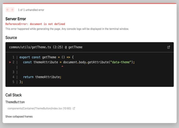
export const getTheme = () => {
  const themeAttribute = document.body.getAttribute("data-theme");

  return themeAttribute;
};

export const setTheme = (theme: "dark" | "light") => {
  document.body.setAttribute("data-theme", theme);

  window.localStorage.setItem("theme", theme);
};
버튼은 아래와 같이 구현했습니다.
useState 초기값에 getTheme 를 사용하지 않은 이유는 localStorage 접근은
window 객체이기에 서버에서 접근이 안되는 문제가 있어 null 로 할당 후,
useEffect 를 통해 할당하는 방식을 사용했습니다.
import { useState, useEffect } from "react";
import Image from "next/image";

import { getTheme } from "../../../common/utils/getTheme";
import { setTheme as setDocumentTheme } from "../../../common/utils/setTheme";

import styles from "./ThemeButton.module.css";

const ThemeButton = () => {
  const [theme, setTheme] = useState<string | null>(null);

  const handleChangeTheme = () => {
    if (theme === "dark") {
      setTheme("light");
      setDocumentTheme("light");
    }

    if (theme === "light") {
      setTheme("dark");
      setDocumentTheme("dark");
    }
  };

  useEffect(() => {
    setTheme(getTheme());
  }, []);

  if (theme !== "dark" && theme !== "light") return null;

  return (
    <button className={styles.button} onClick={handleChangeTheme}>
      <Image
        src={`/images/${theme === "dark" ? "moon" : "sun"}.svg`}
        alt="theme icon"
        layout="fill"
      />
    </button>
  );
};

export default ThemeButton;
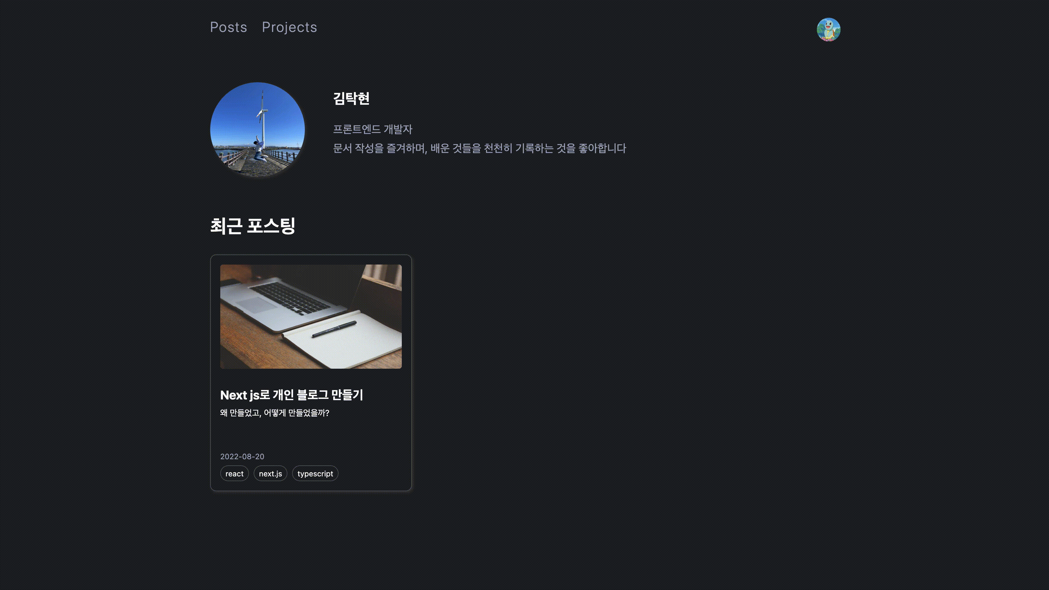
위와 같은 과정을 통해 현재 구현된 블로그가 되었습니다! 🤗
테마 적용은 생각보다 어려웠습니다 ㅠㅠ..
간단하게 ThemeProvider 로 지정하면 될 것 같다는 생각에서 실패했었고,
next.js SSR, SSG 는 서버에서 HTML 을 한다는 점을 다시 인지하게 되었습니다.
평소 React 에서 하듯 window 혹은 document 에 접근해서 에러가 발생하는 경우가 많았습니다 ㅠㅜ..
하나씩 해결해가는 과정이 즐거웠습니다. 😋
이와 더불어 동일한 현상을 겪은 분들의 문제 해석 및 해결 방식을 보며 배울 수 있는 좋은 시간이였습니다! 🚀